I’ve had an idea for a while now where I would occasionally blog about my work and our processes within the Creative Arts team at First MB Church. Don’t get me wrong; we definitely don’t have everything figured out, and sometimes my/our work is less-than-stellar. Trust me.
At the same time, over the past few months it has also been fun for me to see some noticeable growth and improvement in our work quality and team processes. I’m always looking for ways to improve and I love reading stuff like this, so maybe something I post will help someone out there. If not, go read something else. The Internet is big.
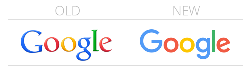
To kick this off, I thought I’d share a little bit about our logo. As you may have noticed, this week Google has received a lot of attention for unveiling an updated logo. Google has made very few changes to their original design created in 1998 until this week.
 Before we get deep into typography and design jargon, let me go ahead and address those of you who may be feeling like this:
I get it. I really do.
I’m a geek about fonts, colors, and design. If you are too, you are among friends. If you’re not, go read something else. The Internet is big.
Back to Google, the new logo utilizes a sans-serif font and is a good example of flat design (of which I am a huge fan). It also follows the cultural trend of attempting to portray the parent company as less academic or corporate and more youthful and fun (which I also like).
The timing of this change is fun for me, because we have been in the process of slowly unveiling and utilizing an update to our logo as well. Here’s a comparison:
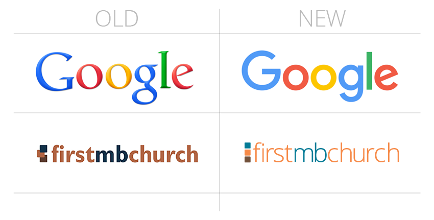 We’ve actually been using this new logo on some projects for several months. Just recently I’ve switched all of our social media accounts to this new look, and we’re getting ready to unveil an update to our church website. Overall I really like the clean, simple, refreshing feel it provides compared to our original logo, which has always felt a little clunky to me. We recently changed our branding guidelines to encourage (… that’s too nice of a word. Maybe ‘force‘ would be more accurate.) our designers to use Open Sans instead of Franklin Gothic.
Our church’s tagline has also recently changed to “real people | real faith | real impact.” I have to admit: this part of the process was… lucky, but I love how it turned out.
Our old logo above was what the church was using when I was hired. I changed the color scheme a bit to feel more current, but I liked the blue, orange, and brown boxes. I studied color theory in college and have read up more the last few years. Before we officially landed on the new tagline, I realized this about our colors:
In color theory world, blue is typically used to portray emotions like trust, loyalty, and understanding.
Orange is typically used to portray boldness, excitement, energy, and creativity.
Brown is earthy and often evokes feelings of reliability and service. Makes sense, right?
As part of being “real people,” our goal is to admit our brokenness and engage in authentic relationships. Blue.
Having a “real faith” means we want our church to be bold and passionate about what we believe. Orange.
Making a “real impact” means we’re willing to do the hard work required to serve each other and our community. Brown.
… I couldn’t have planned that better if I tried.
All that to say, it’s encouraging to me that our change seems to reflect the same trends Google is following and the colors follow conventional design theory.
Very few–if anyone–from our church family have probably noticed the changes we’ve made so far, but that’s ok. I’m really passionate about making good art that makes it easier for people to encounter God and the things in life that really matter. It’s a small change, but I think it was a good one.
At the very least, it’s better than Comic Sans or the Sopranos font.
